Dill.


Running a restaurant demands more than simply delivering great food. You also need an authentic story and compelling visual identity that resonates with your audience and creates a space they want to enjoy.
For Dill, a new Mediterranean Wine Bar & Bistro in Shrewsbury, the brand vision centred on creating a warm, inviting space dedicated to family, friends, and community. Founded by a close-knit group, the restaurant’s ethos revolves around great food made to share, with small plates, oven-fired pizzas, and a carefully curated wine list.
Here’s how we created a visual identity that mirrors their ethos and what Dill is all about.

Simplicity, warmth, & personality
The earthy green colour palette creates the immediate sense of a welcoming, down-to-earth atmosphere essential for a local gathering spot. This also ties into the Mediterranean herbs and fresh produce central to their menu, subtly reinforcing the restaurant’s culinary focus.
Complementing the colour is the striking, handwritten word marque for Dill. Written in lowercase, this element avoids the formality of uppercase lettering, bringing both personality and approachability to the brand. This free-flowing, informal script suggests a relaxed, casual environment, creating the perfect backdrop for conversations and shared meals among family and friends.

A sprig of dill further reinforces this, literally tying the brand name into the visual identity. It cements an organic, thoughtful, and authentic connection to nature and fresh ingredients.
Combined with a simple, clean sans-serif typeface, content provides clarity without detracting from the primary handwritten logo. This approach balances the brand’s unique personality with clear, straightforward communication that’s instantly accessible.

Translation from physical to digital
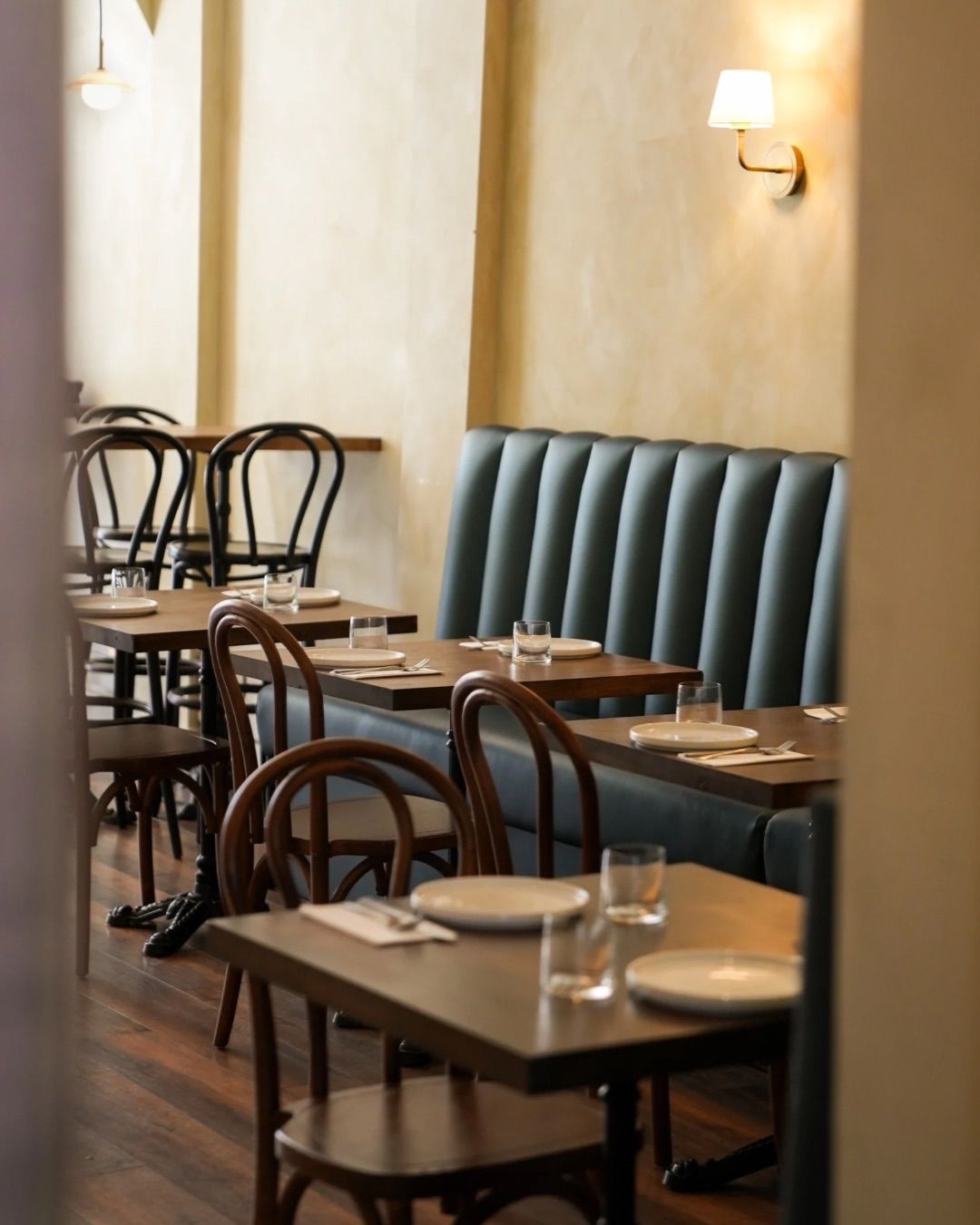
This identity successfully carries across all touchpoints, from social to website to frontage and interior. The warmth and raw authenticity remains consistent, whether walking past on the street or viewing the menu online.
The green frontage paired with the handwritten word marque is soft and welcoming, with high visibility and instant brand recognition. The venue’s purpose is clear.
This extends inside to everything from napkins to menus.
The menu covers adopt the deep green shade with the sprig of dill and word marque debossed, embracing the brand’s simplicity while adding a tactile, sophisticated quality. This considered design approach integrates the whole restaurant experience into the overall brand aesthetic.

As for the digital experience, the simplicity of the colour palette and distinctive logo provide a powerful and easily recognisable online presence. The earthy tones translate well to social media feeds and website design, avoiding overly bright trends for a lasting, sophisticated presence. The simple, raw authenticity of the brand is easily maintained, ensuring every online engagement is consistent, authentic, and inviting.

Capturing the Dill experience
This is a brand identity that captures the entire Dill experience at every touchpoint. The welcoming, purposeful design communicates the brand’s core values of good food, good company, and good hospitality.
By opting for a simple, warm, and honest direction, Dill has created a visual language that resonates with its local Shrewsbury community, inviting them in and reflecting the shared joy found around their tables.
A considered and consistent presence, both online and off.
Looking to capture your hospitality experience?
Our Shrewsbury-based branding and digital agency specialises in translating experiences into compelling branding. Blending strategic thinking with creative design, we deliver identities that translate across all touchpoints, physical and digital.
Let’s turn your hospitality brand into your greatest attraction. Get in touch.